This is the third story in an eight-part series on the Ohio Public Health Advisory System
On July 2, Ohio Republican Governor Mike DeWine introduced the Ohio Public Health Advisory System (OPHAS). The color-coded map assigns a color to each of Ohio’s 88 counties that is supposed to be indicative of each county’s COVID spread.
According to the Ohio COVID site:
“The Public Health Advisory Alert System is a color-coded system designed to supplement existing statewide orders through a data-driven framework to assess the degree of the virus’ spread and to engage and empower individuals, businesses, communities, local governments, and others in their response and actions.”
The OPHAS categorizes each of Ohio’s 88 counties in one of the following four categories:
- Level 1 – Yellow: 0-1 indicator triggered; advisory: active exposure and spread.
- Level 2 – Orange: 2-3 indicators triggered; advisory: exercise high degree of caution.
- Level 3 – Red: 4-5 indicators triggered; advisory: limit activities as much as possible.
- Level 4 – Purple: 6-7 indicators triggered; advisory: only leave home for supplies and services.
Each county is graded on the following seven indicators: new cases per capita; sustained increase in new cases; proportion of cases not in a congregate setting; sustained increase in Emergency Department (ED) visits for COVID-like illness; sustained increase in outpatient visits for COVID-like illness; sustained increase in new COVID hospital admissions; Intensive Care Unit (ICU) bed occupancy.
A county triggers the sustained increase in new cases indicator when positive cases trend up over five consecutive days in the last three weeks.
According to the alert indicator details found on the Ohio coronavirus website, if the number of daily new cases continually increases day-over-day, then that means the virus is spreading more in a county.
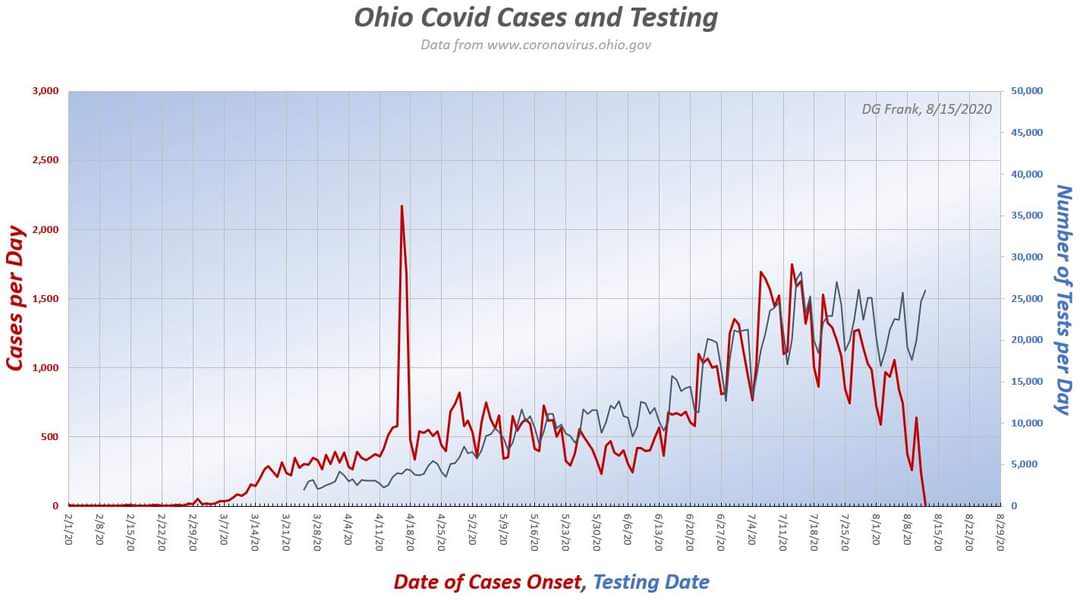
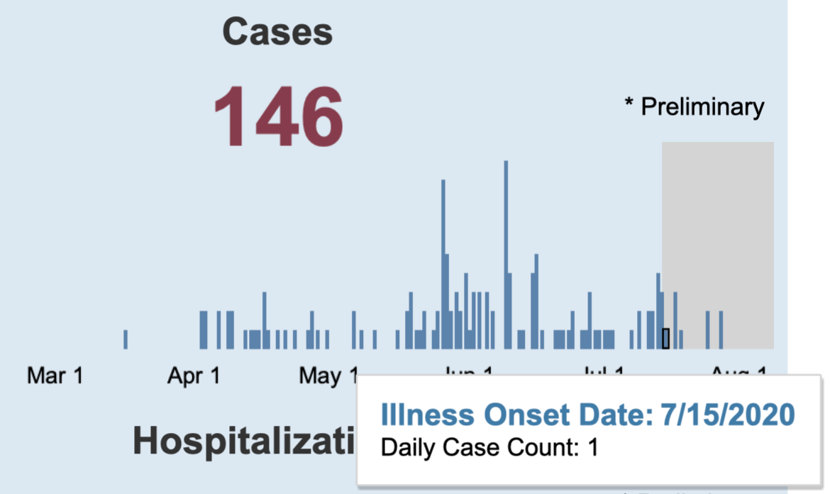
In the graph above, the red line represents the onset date of the positive case and the blue line represents the test date. The graph was produced by Dr. Douglas Frank, of Dr. Frank Models, who noted: “I normalized the display scales by the area under the curves. Note that these are testing dates, and the cases are date of onset. Because there is a lag between the day a test is given, and when a test is completed, reported, and assigned to a date, the red curve lags the blue one.”
The graph appears to show that increased testing caused increased positive cases.
Testing uncovers active infections. Testing also results in more false positives, according to the Journal of The American Medical Association – PCR tests are so sensitive they can pick up positive results for up to three months, well beyond infectiousness.
The U.S. Food and Drug Administration (FDA) discloses additional reliability issues with the RT-PCR test and DiaSorin Molecular test (noted in a previous article that discussed a Warren County college-bound woman).
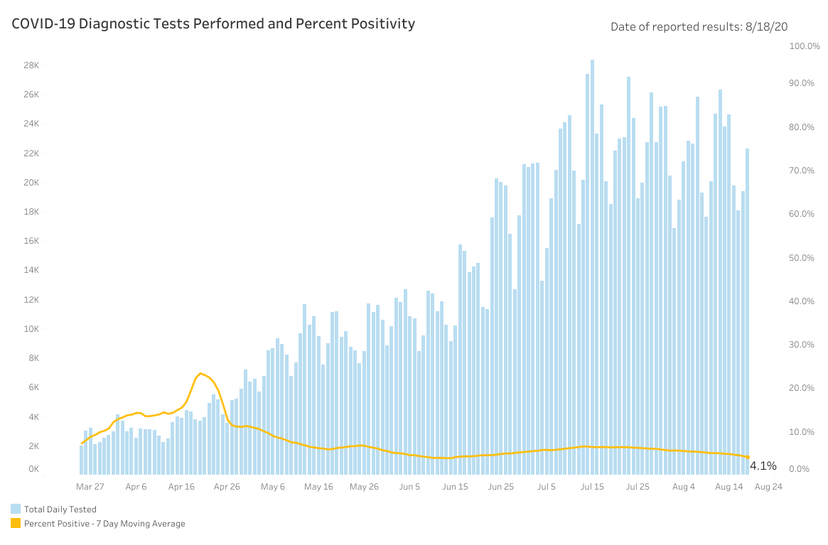
Melanie Amato, the press secretary of the Ohio Department of Health (ODH), told The Ohio Star, “The total number of diagnostic tests for COVID-19 reported to ODH is 1,905,419. These numbers include PCR and molecular tests. This data includes laboratory testing from hospitals, private labs and the ODH lab. Daily numbers are available on the coronavirus.ohio.gov website and are presented by result date.”
Based on this response, it appears the only antigen test administered in Ohio was the test given to Governor DeWine that returned a positive result prior to his visit with President Donald Trump.
It is important to note in May the ODH changed its testing methodology. Prior to May, tests were given to the sickest patients with COVID symptoms – even then a test required authorization from a healthcare professional. Testing uncovered patients sick with COVID, consequently, Ohio’s positive test rate was comparatively higher.
As of August 20, the Ohio positive test rate is 4.1% – the World Health Organization and Johns Hopkins indicate that a rate near 5% indicates the virus is under control.
As testing increased the average age of cases dropped significantly. The average age of hospitalization decreased a bit, while the average age of death didn’t budge.
While tests drove up cases, there were slight increases in hospitalizations and declines in death. The increase in hospitalizations may mean some hospitalizations, as CDC Director Robert Redfield noted, may be a consequence of incentive for hospitals. The drop in hospitalizations-to-deaths may also mean therapies improved.
Increases in positive tests – even without substantial upticks in hospitalizations and declines in deaths – are not viewed positively by Ohio decision makers. Positive tests are trumpeted as a sign of risk instead of relief.
In March, Amy Acton said over 100,000 Ohioans were likely already infected. Five months later when Ohio surpassed 100,000 cases, DeWine called the milestone troubling.
This may signal the administration is ignoring the relief provided by herd immunity. The CDC conducted three separate random sample tests at 10 points around the country to monitor antibodies and the prevalence of COVID in the U.S. population.
CDC Director Redfield has repeatedly claimed existing case count may be 10 times higher around the country – and in June estimated 5% to 8% of the population had been infected.
On April 20, Ohio recorded a total of 112,003 cases. Based on Redfield’s projection, Ohio may have more than 1.1 million infections – about 9.6% of the Buckeye state.
DeWine and Lt. Governor Jon Husted repeatedly point to studies from American Red Cross and statistics from independent lab results around Ohio claiming the statewide infection rate is somewhere between 1% and 3%.
However, those numbers do not represent randomized samples. Acton committed to a 1,200-person randomized antibody sample back in April. As of August 20, those results remain elusive.
Those results are gaining in importance as a new study found a dozen scientists who believe herd immunity may now be possible at infection rate of 10%.
Smaller population counties in Ohio, like Hardin County, do not have much wiggle room for error when it comes to positive test results.
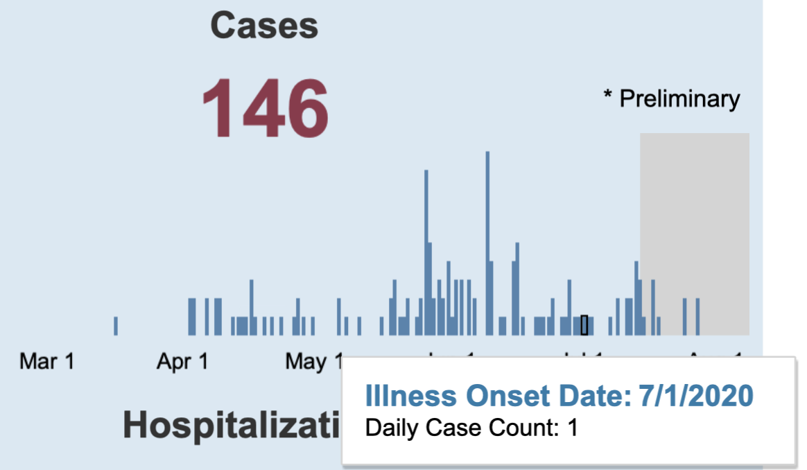
Between July 1 and July 15, the average number of cases in Hardin County blipped from one-per-day to two-per-day. This slight increase triggered the sustained increase in new cases indicator.
Indicator 2 counts probable cases (without a confirmed lab results). The Star learned “cases in indicator 2 are both confirmed and probable.” According to Amato, between July 29 to August 18 only 4% of cases include probable results.
The 4% is an average for all of Ohio, as was cited in article two of this series Logan County reports 35% probable cases in their overall case totals – indicating significantly lower probable cases in other counties.
Probable cases include epidemiologically linked cases -a case unconfirmed by a lab result that is counted positive because the unconfirmed case was in close contact for longer than 15 minutes with a lab confirmed positive case.
Because epidemiologically linked cases are included, numbers reflect non-confirmed cases. For instance, Delaware County, Ohio recorded a COVID case and then used the epidemiological link standard to assign positive cases to each immediate family member of the confirmed case, The Star learned from a Delaware official.
A few confirmed cases, probable cases, or even false positives can produce mini upticks. This scenario is exacerbated with pop-up test sites and testing initiatives targeting asymptomatic and curious constituents. This can be problematic for rural areas – spots DeWine has cited recently during press conferences as places of concern.
– – –
Jack Windsor is Managing Editor and an Investigative Reporter at The Ohio Star. Windsor is also an Investigative Reporter at WMFD-TV. Follow Jack on Twitter. Email tips to [email protected]. Kathryn Huwig was a data and analysis contributor.